15 points
Character Business Cards by Production Justin
July 14th, 2006 5:23 PM
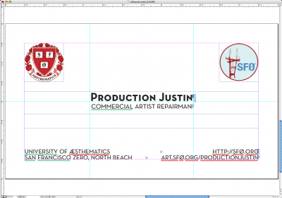
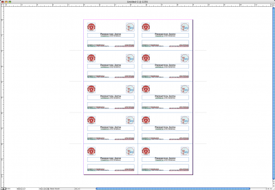
I decided for a traditional "university" feel for my business cards, since I'm with The University of Aesthematics. The basic layout resembles the cards I used to make for UC Davis faculty. I decided to use a more artistic looking and interesting typface than the usual garamond or berkeley. Nutraface seemed like a good fit, and it looks great.
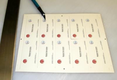
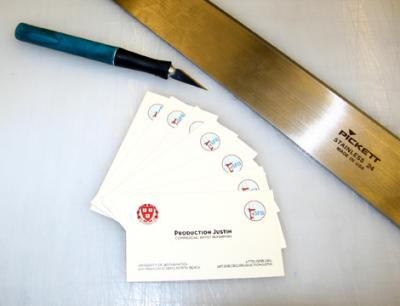
I picked out a nice cream/off white cardstock to print them on, then trimmed them out. They don't look too bad, but then I've made hundreds of business cards in my life.
I picked out a nice cream/off white cardstock to print them on, then trimmed them out. They don't look too bad, but then I've made hundreds of business cards in my life.


