Character Business Cards by Cameron
April 26th, 2006 4:33 PM0 vote(s)
Terms
(none yet)5 comment(s)
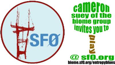
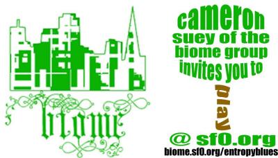
A-ha, thanks for the criticisms. I went with the top design and tweaked the text a lot.
Let me know if this works better... a few questions:
1) Does anyone know if it is possible to get a high res "biome" image to use?
2) Is it okay to reprint this image?
i had sent a request for a high res version of the bartpa logo through the feedback feature. sean responded that he probably had the vector art for it but i haven't heard back. probably has the biome stuff too.
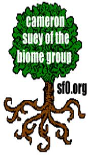
much nicer tree!
not to drive you crazy, but now i feel like the biome logo and tree don't jive.
I am incapable of being driven crazy. :)
Yeah, I was thinking they weren't complementing each tother... What about turning the tree 90 degrees to run the card lengthwise, with the biome logo as very small part of the tree itself? Or possibly, the sf0 logo instead of the biome logo?
I'll play around with it more.
Tried one with the sf0 logo, and I like it better. That's the one I'll probably be going with for the time being, unless anyone has any suggestions. I like tweaking the image more than I like the idea of actually making it, so I'd welcome all input.


on the top one, i think you should use a bolder text for the tree, work on the shape of the tree, change the sf0.org color to brown or green, and i think t should be "invites you to play"
in the bottom one, the tree seems kind of blurry and i believe it needs to scale to 3.5x2" @ 300ppi for printing , so keep that in mind, also i don't like the sf0.org on the side like that (maybe on the bottom)
in general i like the top one more.