Character Business Cards by Fenton Crackshell
April 25th, 2006 1:04 AM4 vote(s)
Terms
rubinlovesit7 comment(s)
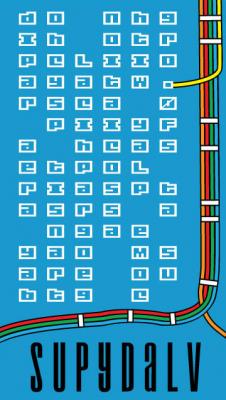
I really love the one with the bart tracks on it. It looks amazing.
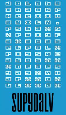
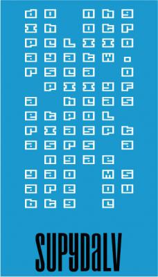
hmm, the text is meant to be difficult to read; is that the problem you are having with it? or do you feel like i should use a different but still challenging font/arrangement?
making those bart tracks is a bitch.. i couldnt find any easy way to do it in illustrator. they need some more work.
thanks for responding guys
Wow, you drew them, crazy. I thought you just took them off a map.
Yea, you're going to find this funny, but I think the font is wayyyy to easy to see as letters. It's still hard to read, but once you figure out what it is it doesn't take that long to figure out. :P
Bonus point to you for hand drawn Bart tracks.
I figured out what it says! And I dig it too
For some reason I tried to read that from right to left at first. It makes somewhat less sense.


Really like it, especially if you were to print it on white glossy or matted cards (blue ink on white). Three things I'd change if this was mine would be the font used for the white text, clean up the Bart system tracks a little, and maybe space out the letter for your name so they span the whole width of the card.
All and all it's pretty pimp.