


One Letter Off by Kattapa
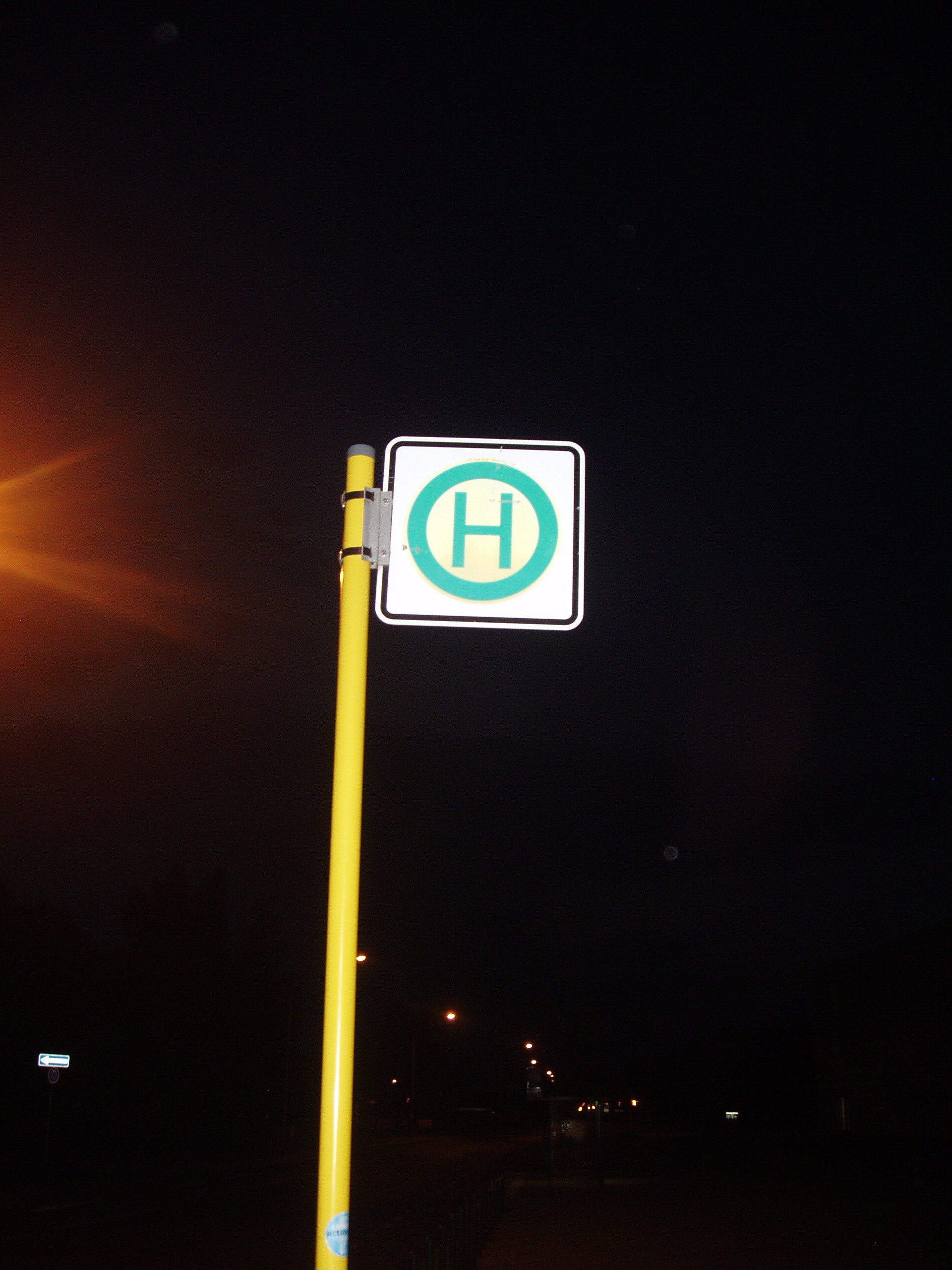
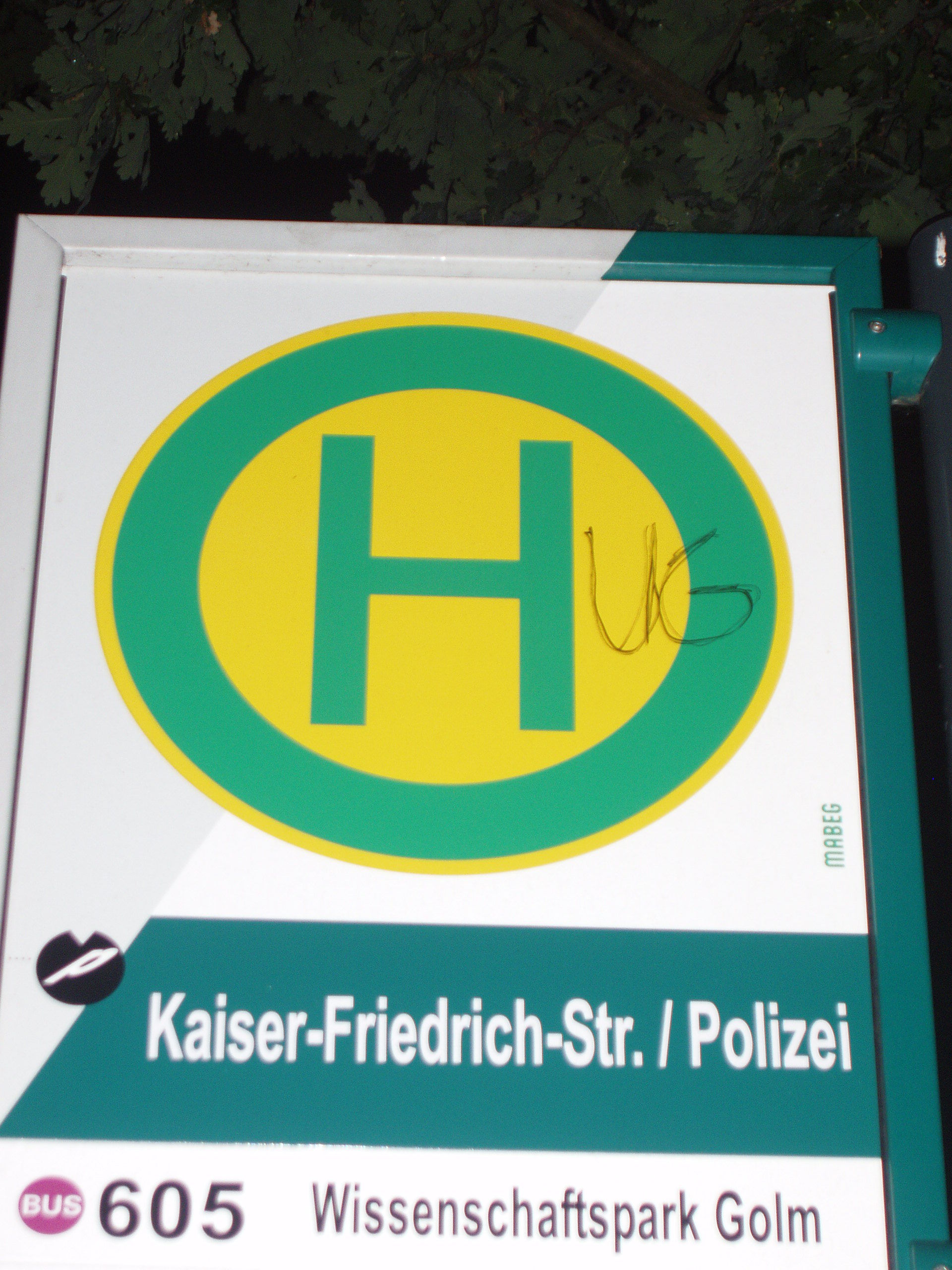
June 5th, 2011 4:26 PMThis is the standard German bus stop sign. It is... somewhat boring.
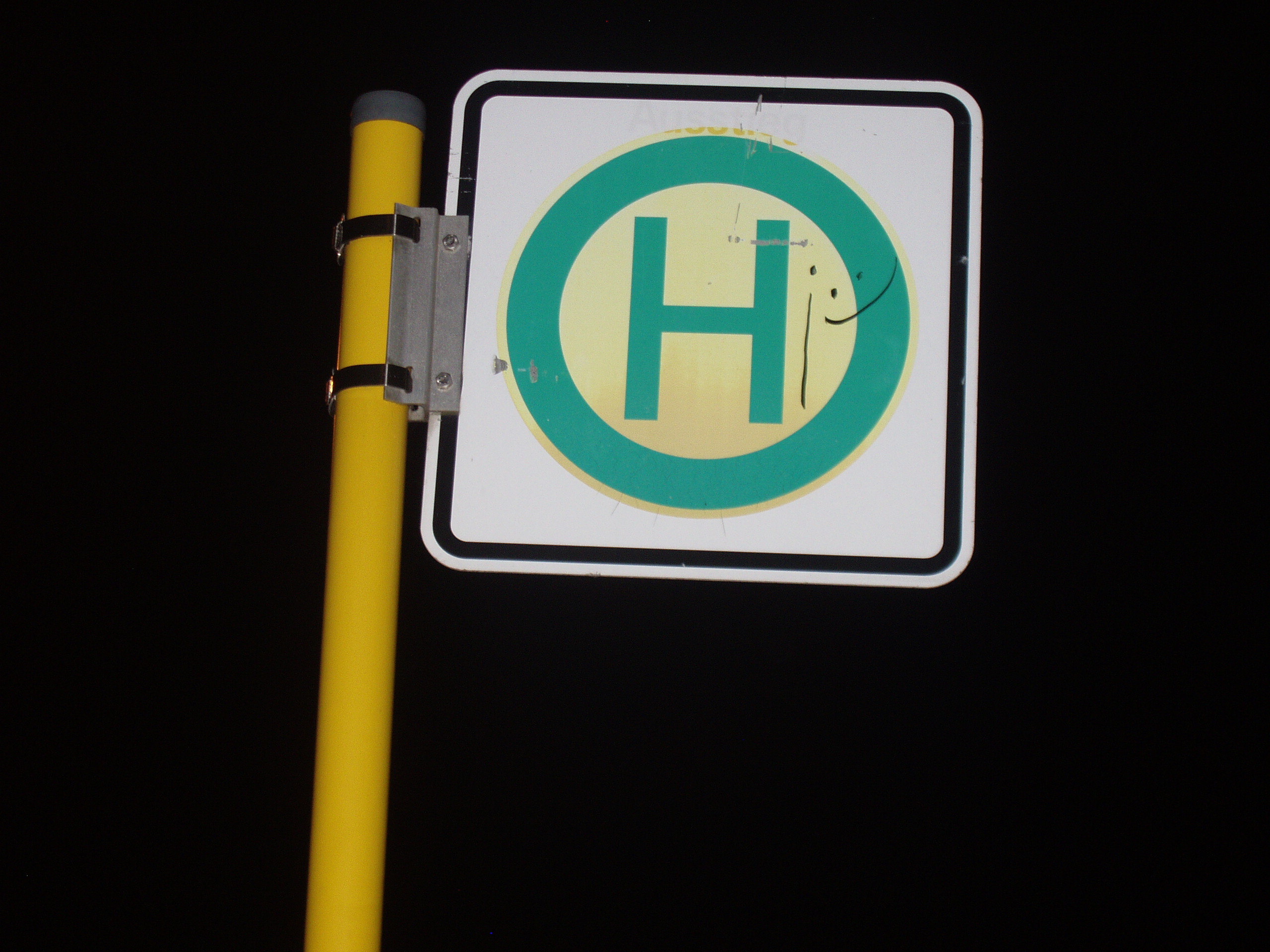
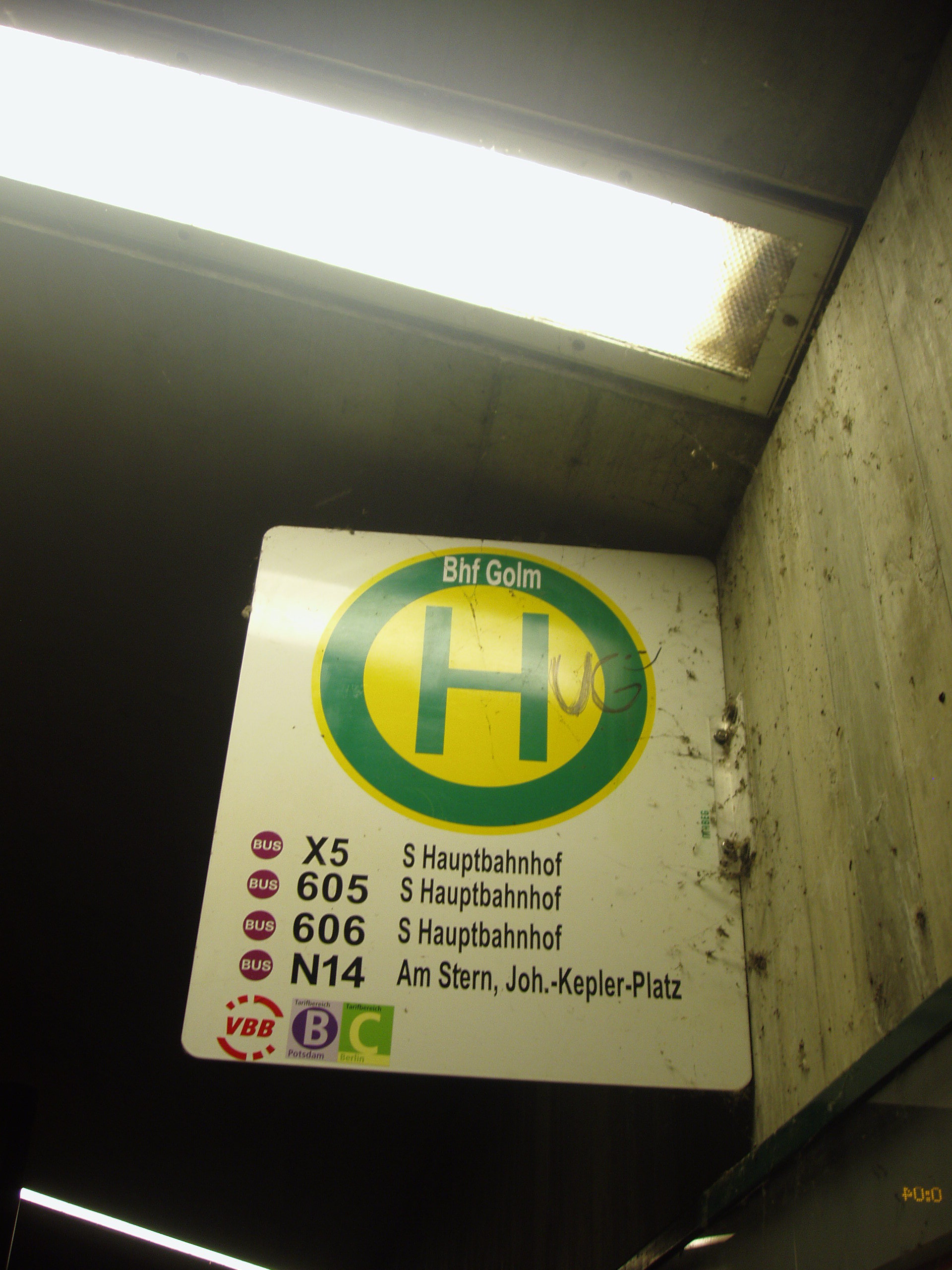
This is its new design:
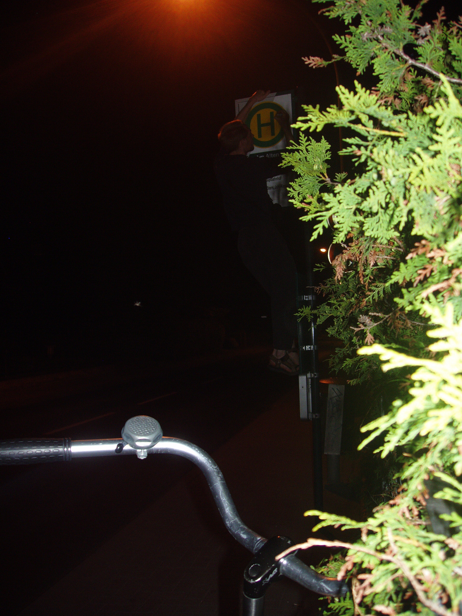
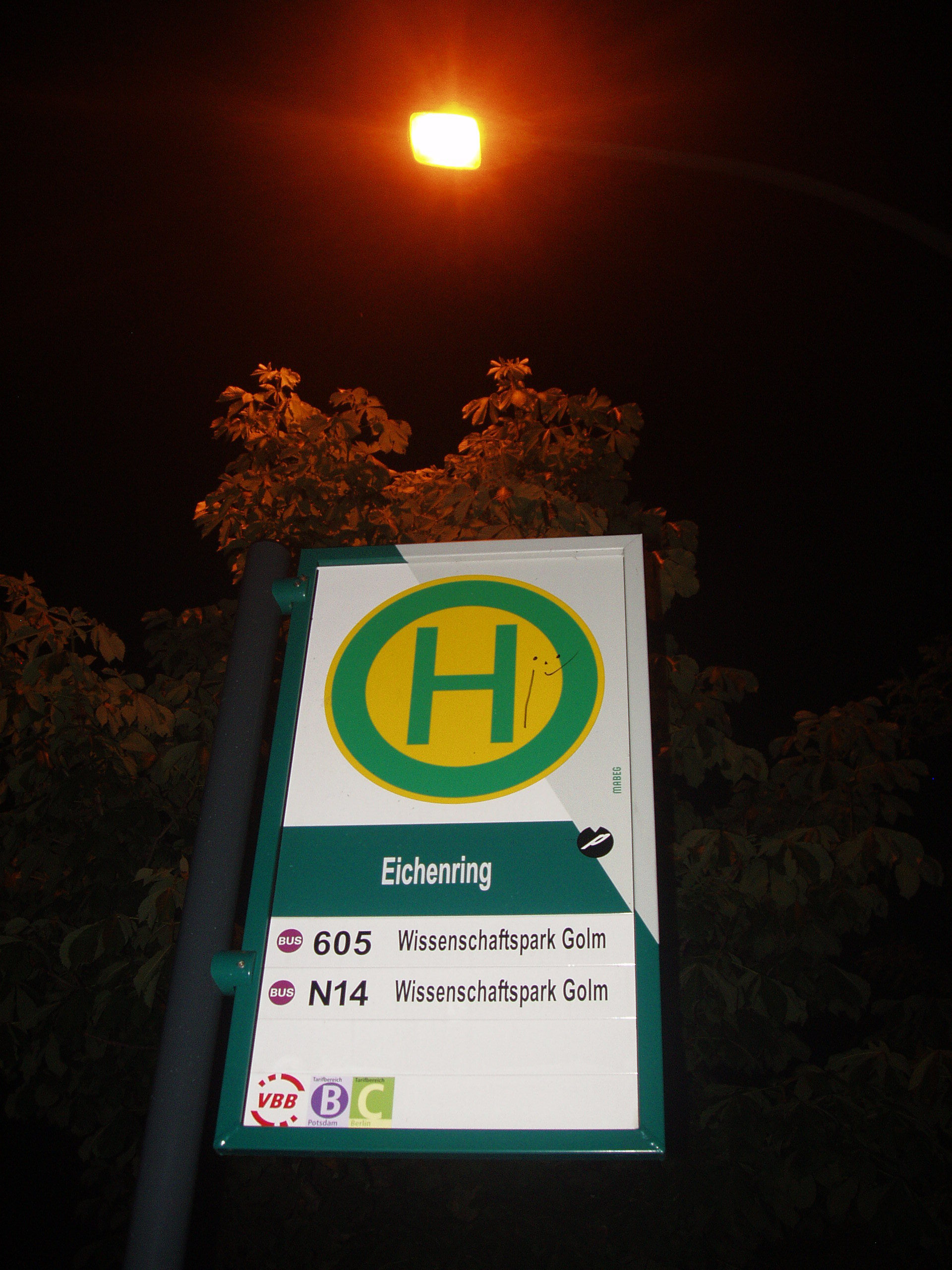
And this is how it's done: (had so much fun)
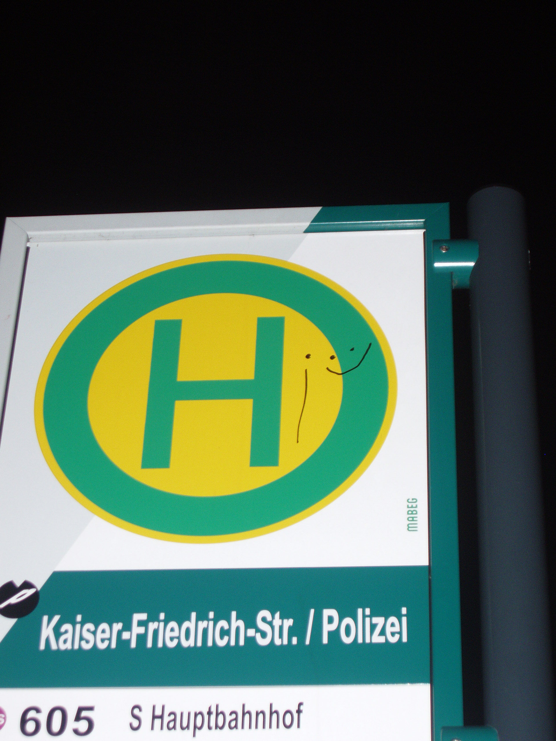
The police station should of course not be excluded:
And..
after doing quite a lot of these, I ran into someone, I had met a couple of weeks ago, it was nice to meet her again, and chat a bit while walking to her home. Before leaving she invited me to come to her choir sometime.
...
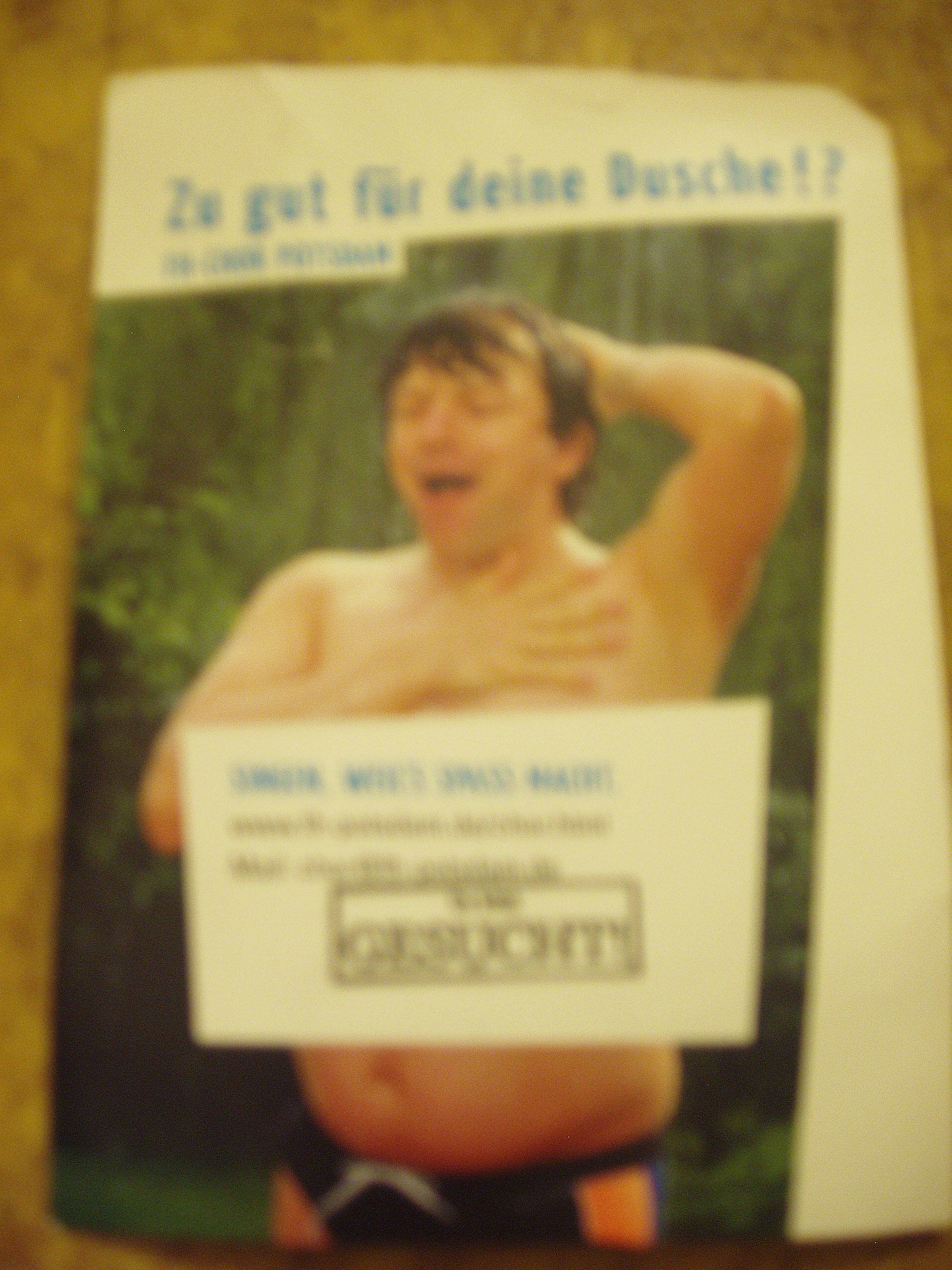
"too good for your shower?!"
This is what I love about being out on the streets, you never know what will happen.
...
Biking through the park:
And doing the same thing on the way back :)
Then I came up with an alternative text, and I especially loved writing it at such a macho place as the police station:
From there I started alternating.
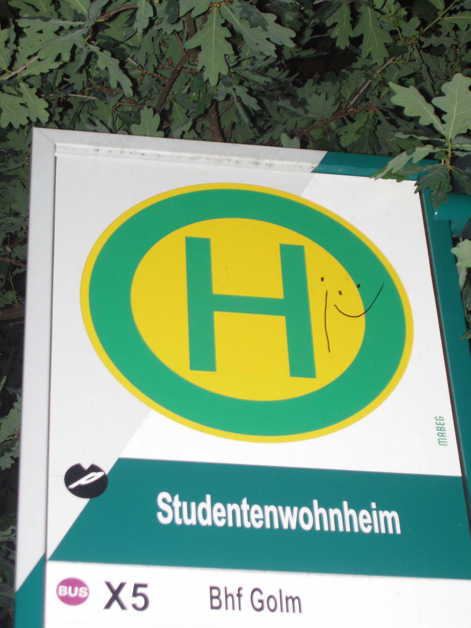
And also did something else:
Fin.


12 vote(s)

Reed Peck-Kriss
5
Dela Dejavoo
4
Pixie
1
Not Here No More
5
C. J.
4
the trace
5
Ty Ødin
3
Con Tricker
5
LittleMonk
4
Juliette
3
Rabid Badger
4
Amoeba Man
Terms
(none yet)7 comment(s)

Vote for Gol(e)m.
Make your pictures smaller. They're a pain to load.

I'm not so experienced at adbusting and the like (not yet anyway). What kind of materials can you recommend?
Do you know of any decent way to resize pictures? Opening them one by one in paint does not seem the most effective and downloading some random freeware also seems somewhat suboptimal.
Any other tips?

Kattapa: If you upload your pictures to sf0 (any size), they will be automatically resized for you. You can include them in your praxis using the [proof] tag (just click on the proof button and insert the correct number, starting at 1) - it also allows you to specify a display size.
Thanks! And it is also a lot quicker than working with image source codes.
And some tips in exchange:
http://www.youtube.com/watch?v=21iVQ0iXs00 Poster rehashing
http://www.youtube.com/watch?v=GKYwJ5wKeCU Massive takeover
http://www.mastazine.net/ An online magazine for creative activism

I'd vote higher if you had taken the time to make the added letters more prominent/permanent, but I really like the idea.